11 | 06 | 15
Interior design ideas for pubs.
Owning a pub can be hard work, and this extends well beyond the day to day running and management of the establishment. Pubs especially become tired and dirty looking very quickly. You may be thinking about a freshening up or a complete overhaul of the premises. Here we provide you with some options on what looks good.
Bear in mind that when we think of a pub, we tend to get an image of the Rovers Return like in Coronation Street. All pubs (and arguably a lot) are not like this and it is important to be aware of that, since this feeds into people’s perceptions and ideas about style and interior design ideas.
The traditional look.
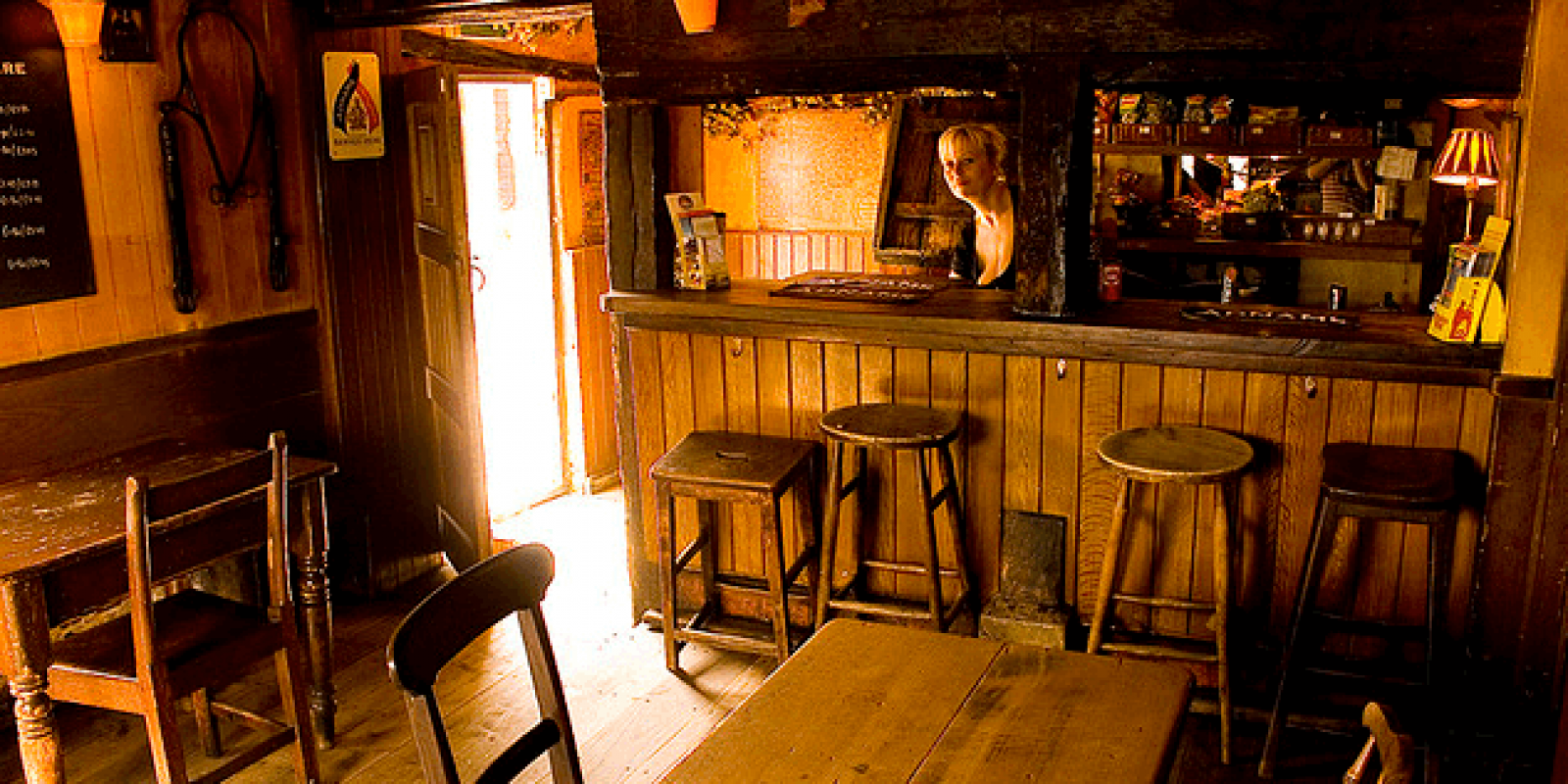
This is very popular and there is nothing like walking into a warmly and homely looking pub that reminds you of the good times when we were all younger. The décor can give a great atmosphere, and if you are going for this approach it is important to ensure that modern is completely banned as the effect will be spoilt.

The above picture looks the defining example of what a traditional looking pub would be like. The wooden tables, chairs and beams help to promote this giving a rustic style feel and impression. Notice the chalk board in the top left of this photo – takes us all back to the old school days and keeps in step with the old fashioned theme.

The modern look.
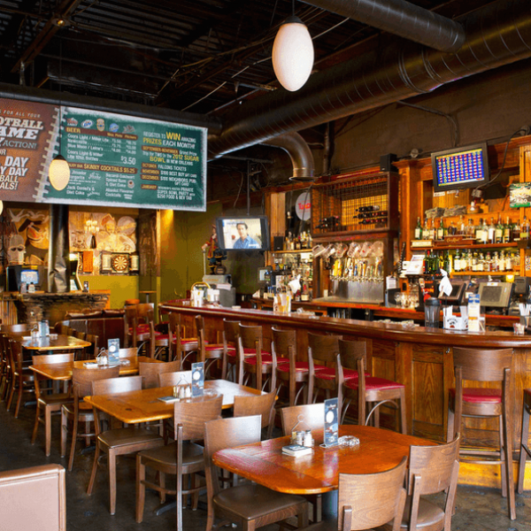
Of course you could always decide to go for the exact opposite of the above and have a modern, fresh and quirky looking establishment. Thinking about the furniture, lighting and layout are probably areas to consider if you are going for this angle.
When it comes to thinking of modern pubs you automatically think this will be an expensive project, but it doesn’t have to be all top quality fixtures and fittings. As shown by the shot above, a modern look is portrayed, but with quite a modest look and feel. Modern and style can be accessible for all.
Re-use old premises or make an adaptation.
Some of the best looking pubs are ones which have had the venue used for another purpose at an earlier time – we are thinking the likes of churches, railway stations etc. These venues have then gone onto being pubs, but kept the original features so you are still well aware of the original purpose of the venue by its surroundings.
Generally this would involve moving locations which of course is not practical, however you don’t necessarily need to go to this extreme. If you are near a venue of interest then why not name it accordingly – the church pub or station pub for example. Then, bring in features to make it look a little your ‘twinned’ venue. This can work surprisingly well.
Pick a theme.
Would you like to base your pub around something specific? For example is your pub mainly frequented by older ladies and gentlemen? Have some medals or war memorabilia on show. This will make the customers feel at home and gives a focal / talking point. A theme doesn’t have to be a permanent one, and if you have different rooms in your pub you may want to dedicate certain areas to certain themes. Have a think about this – there are plenty of popular eras that would fit and suit a range of clientele.
Think about seating areas.
This might sound a bit strange but it is a good point. When people have a drink in their hands they are inclined to sit down and relax. Simple tables and 4 chairs can be boring and predictable, and there is so much more that can be done.
As the picture shows booth seating is one of the alternatives that are on offer. You could be surprised how incorporating something like this will make a big difference to the design of your pub. You could expand on this idea further. For example if your pub is for couples, you could make the booths enclosed and use flowers and candles to make a romantic looking setting.
A great idea to draw attention to the bar is to have a feature of glitter wallpaper showcasing in sight of view.
When it comes to the interior design of a pub, thinking is key because of the vast scale of the project. One refreshing point to know is that there are at least plenty of options and ideas available.

